You have the perfect resume in hand, ready for the job hunt. You’ve proofread for typos, double-checked the sections, and everything seems good to go.
But, there’s one last piece of the puzzle left:
The job post doesn’t state which format to use - should you choose to send it in PDF or Word?
Get it wrong, and the Applicant Tracking System might eat your resume before it even reaches the employer.
- Which Resume Format is Best - PDF vs. Word
- 8+ PDF Resume Templates
- 4+ Word Resume Templates
- Key Takeaways
Which Resume Format is Best - PDF vs. Word
First things first. Make sure you search the job posting for any instructions about the format. Most job postings mention which format to use for your resume.
If you’re sure nothing is there, search in the “Career” section on the company website for information.
Still no answer? Now it’s the time to pick favorites!
Here are the pros and cons of both PDF and Word, with our take on which one is best.
Word Resumes
- The Word format is easily opened by many devices, programs, and systems.
- An ATS (Applicant Tracking System) reads the Word format resume without an issue.
- Some companies simply prefer the resume to be saved on Word.
- The format and order of your Word document can get completely messed up. The recruiter could open it with another tool that is not Word, or a different version of Word. Your one-page resume gets spilled over to the second page, the font changes, or it may even appear as an unclear code. Either way, there’s a high chance of the document appearing messy.
- Word is editable, which gives the reader the chance to change or delete parts of your resume by accident.
- If you work in a creative industry, you don’t get the chance to be expressive on the document.
PDF Resumes
- PDF formatting never gets scrambled or messed up. It stays exactly as you designed it, so the user receives it accurately.
- PDF is compatible with and works well on any system or device. Everyone can virtually access your PDF resume. It’s also secure and virus-free.
- The document looks cleaner and more professional.
- A PDF format gives you more freedom to be creative and innovative with the design. You can also use apps like Adobe Photoshop or InDesign to personalize the layout.
- Although it is a very rare issue, some old ATS may find the PDF format problematic. The software sometimes skips graphics or other creative features.
Now you might be wondering: which format is better?
In most cases, you’d want to stick to a PDF resume.
The first and most important element of a resume is readability. To begin with, if your resume is not understandable, you won’t even get a chance at the job.
As we previously mentioned, PDF has a consistent format that won’t disappoint you. Word, on the other hand, is risky and more likely to deliver a messy resume.
Last but not least, you should also consider the final look of the resume:
Microsoft Word always passes the ATS, but PDF gives a better experience. It’s more customizable, cleaner, and generally nicer to look at. You can add sprinkles of your personality to your resume and boost your chances of getting the job.
Unless the company specifically requires you to send a Word resume (because their ATS doesn’t read other formats), we recommend you use PDF.
When sending a PDF resume, be careful not to save it as an image (.jpg or .png). The ATS only reads the text, not images.
8+ PDF Resume Templates
Online resume builders are an awesome option when you’re making a resume.
They are ready-made and set up for you - what’s left is to fill in the data. You can customize everything: font, color, layout AND you can also get feedback on the content.
The best part: You can save your resume as a PDF.
Check out our list with the top PDF resume options below.
1) Simple by Novorésumé

The name Simple fits the bill. If what you’re looking for is a clean and convenient resume, this is a perfect choice. It’s modest, easy-to-read, and professional - everything you need from a good resume.
Since the design is more on the serious side, it’s best for people working in conservative industries or senior positions.
2) Creative by Novorésumé
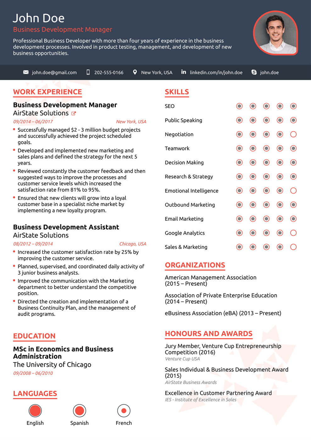
Trying to stick out in the crowd? The lively style of Creative is the best choice.
The resume reflects your expertise and job experience in a fun way. With the use of bulleted lists and infographics, it creates a stylish, chic look. However, it doesn’t overdo it with high spirits: it’s still a well-organized and professional template.
3) Modern by Novorésumé
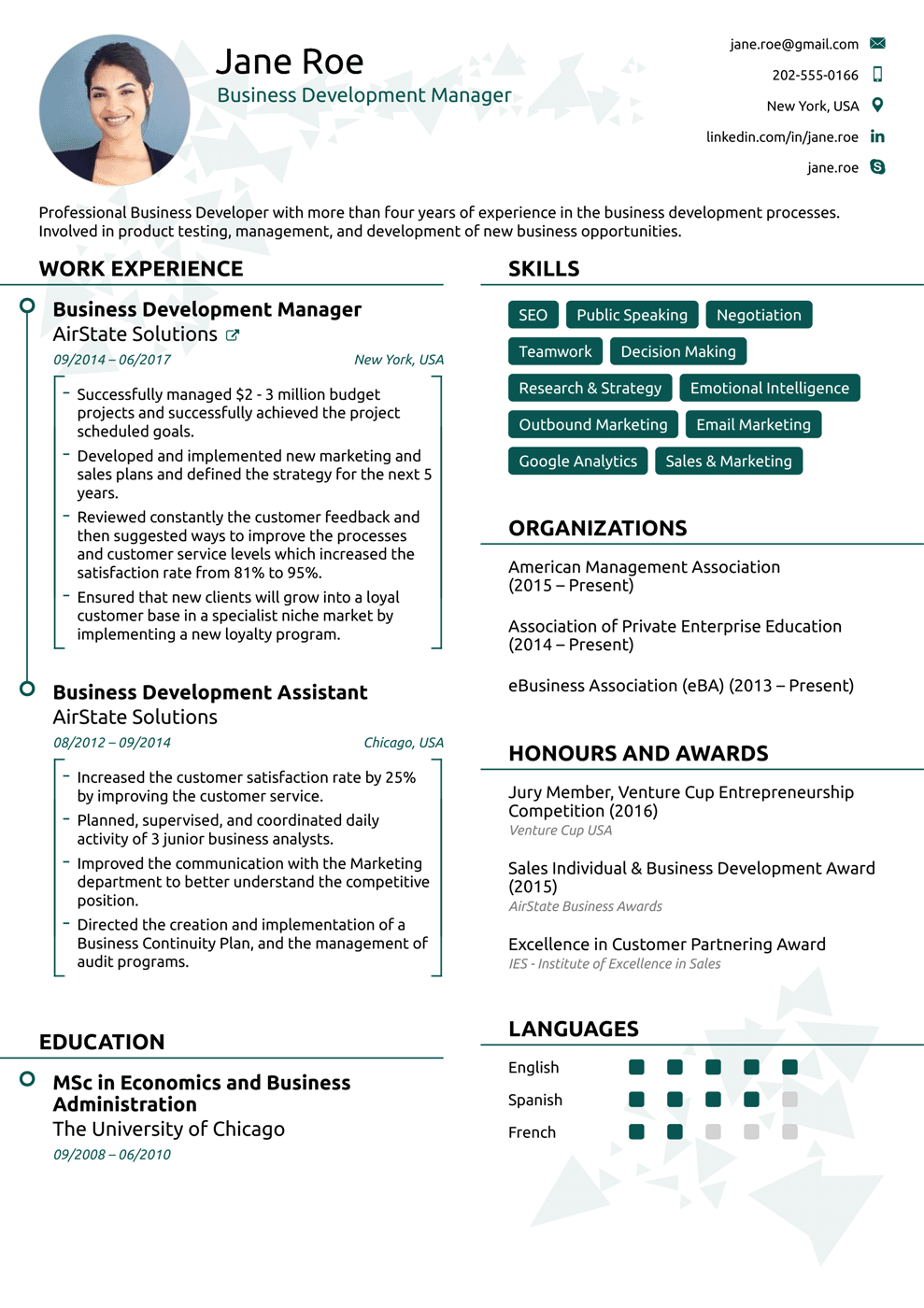
Modern is an exciting and pleasant template. It has square brackets, a lot of bulleted points and infographics, and it highlights your skills with a strong green color. You can include a picture in the resume header as well as the languages you speak.
It’s an awesome choice if you’re looking for a job in a competitive industry because your resume will definitely stand out from the rest.
4) College by Novorésumé
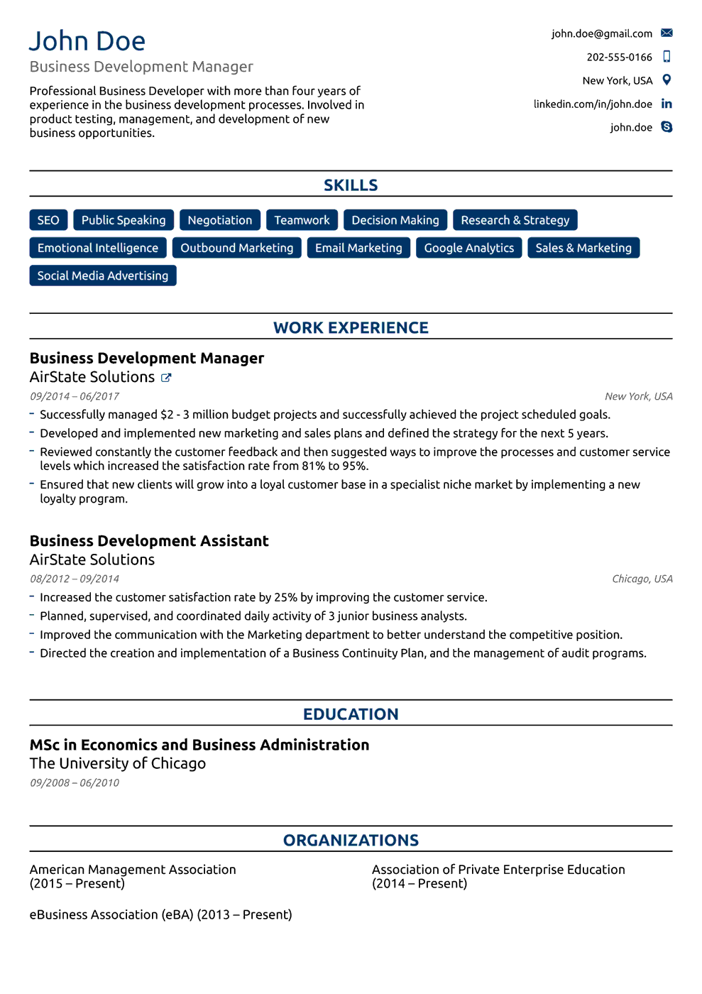
This PDF resume template is for the recently graduated college students. It is simple and attractive, with much ample room for work experience and skills. You will look professional and systematic while highlighting your personality.
5) Executive by Novorésumé
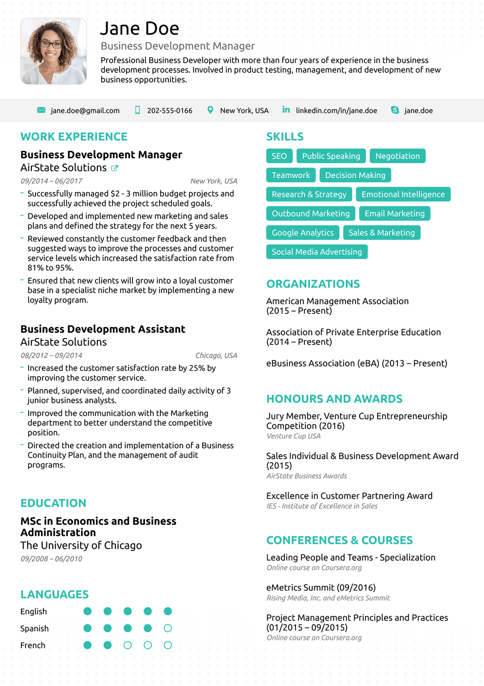
When you need to present yourself as an eligible, qualified candidate with years of experience under your belt consider using this template to showcase your skills with style.
The first thing the HR manager notices: green highlighted skills. They are purposely placed on top, to really “wow” the recruiters and make you stand out.
Half of the space exemplifies your work experience to sway the recruiter with your impressive accomplishments. There’s also a picture icon, education, organization, and personal information sectors.
6) Basic by Novorésumé
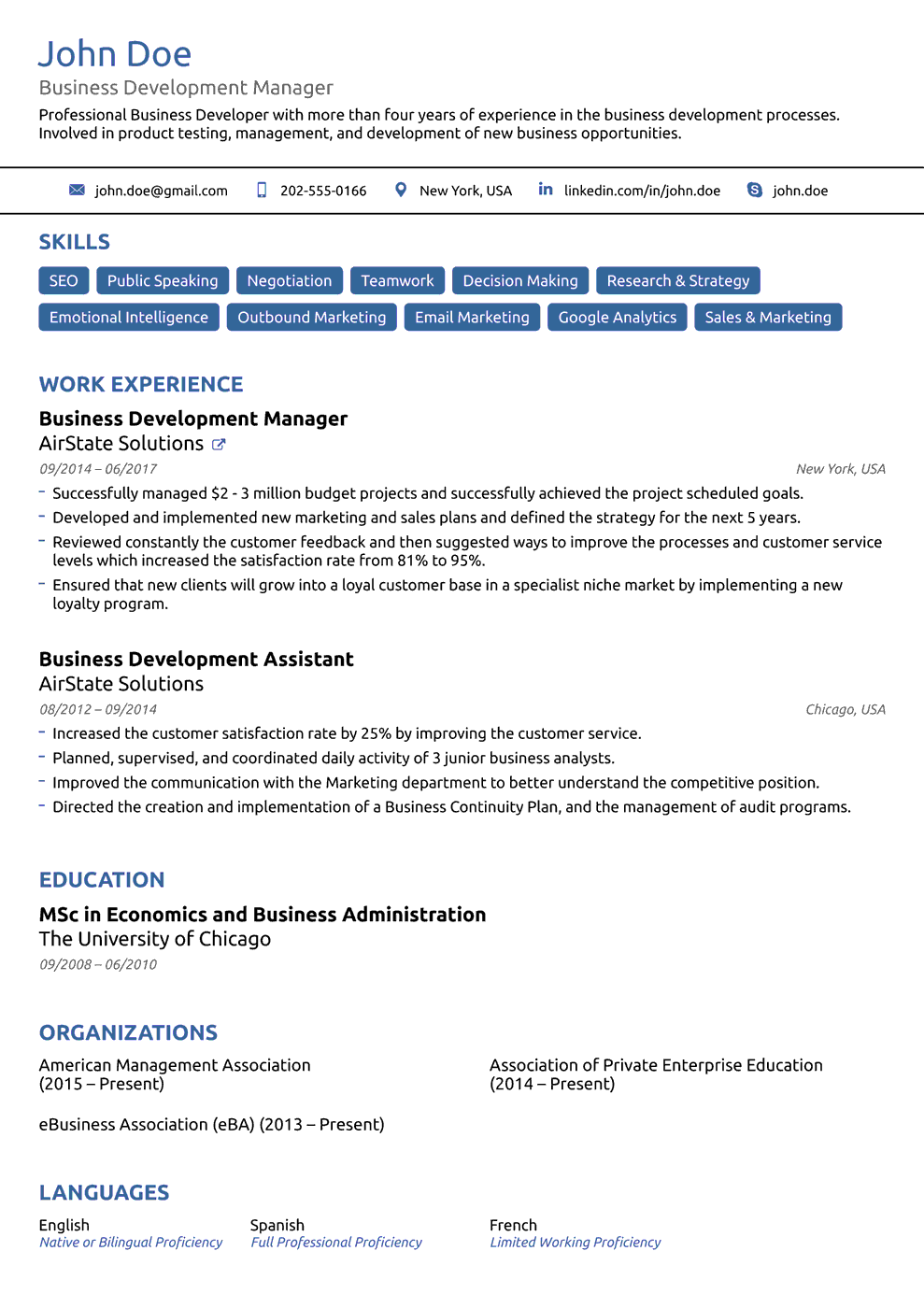
Basic is for everyone who thinks that simplicity is the best approach. Properly organized with multiple sectors, the resume has a professional and minimalistic look. It doesn’t equate to boring though! There’s a pop of blue to brighten the spirits and keep the employer interested.
7) Functional by Novorésumé
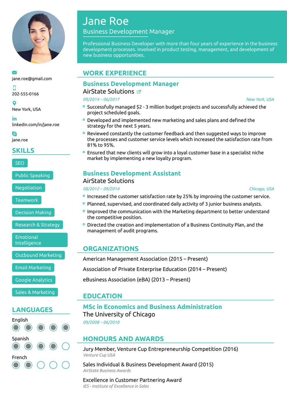
Don’t have a great deal of experience to show off with? Functional has you covered. The template highlights your skills, resume objective, and personal information. It is minimal and refreshing, and the green mint color makes it super easy to read.
8) Professional by Novorésumé
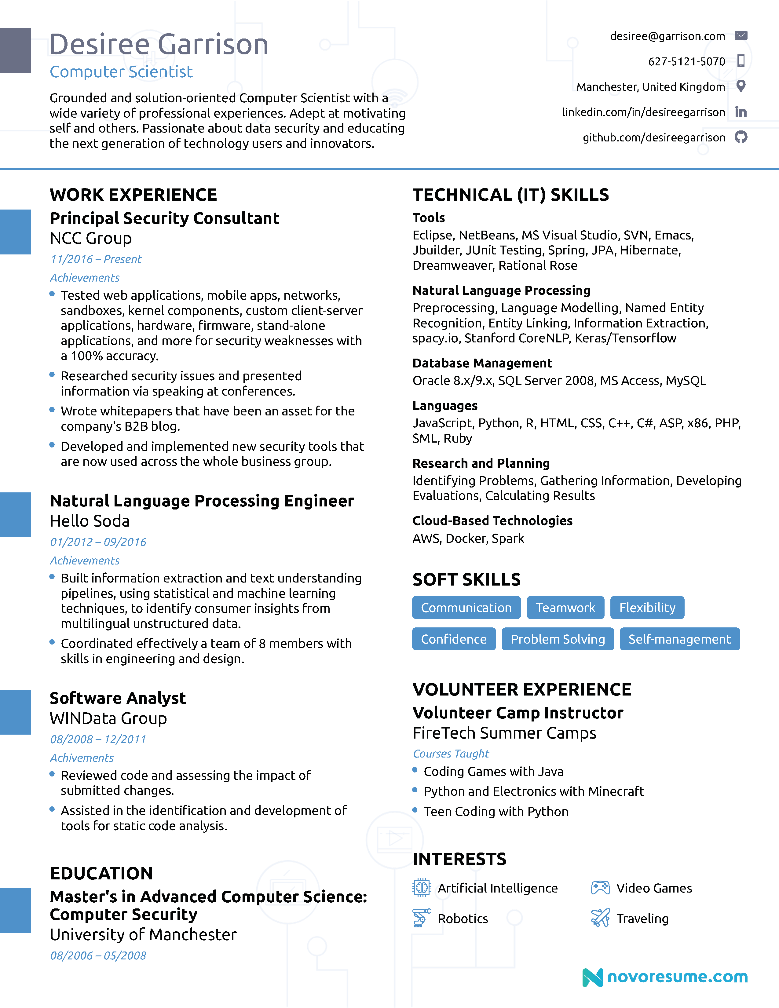
Space is the best feature Professional has to offer. There’s a considerable amount of it you can use to fill in with work experience, skills, education, and other accomplishments. Use the template if you have extensive professional background to share.
The layout is clear-cut and elegant. Its minimal amount of icons balances perfectly with the warm blue tones for an overall pleasing aesthetic.
Still not satisfied? Browse our complete list of resume templates!
4+ Word Resume Templates
You can find Word templates in two ways: pre-customized in the software or through external sources. We’ll explain how to do both, starting with the built-in resume templates.
Here’s how you can find the templates that come with the software:
- Open MS Word
- Click File from the menu bar on top of the screen
- Select New
- From there, you can select a number of different formats (resumes, flyers, cards, cover letters, and more)
Each template has a short description as well. It gives general information about the design and what impression the resume makes on the recruiter.
Here’s what it should look like:

As you can see, there’s a diversity of options to choose from. Just pick a theme and color scheme, and you’re good to go!
Here’s a list of the best free templates that come with the software:
1) Functional Resume
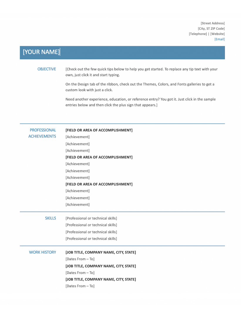
Looking for a plain, sugar-free template? Microsoft Word comes with plenty of simple, functional ones you can use.
The design below is perfect if you want to play it safe while making an impression. It’s a great option if you’re an entry-level candidate. It highlights your objective and achievements first instead of the work experience.
There’s enough color to make you stand out and the sections are clean and orderly. With this template, you can’t go wrong!
2) Modern Chronological Resume
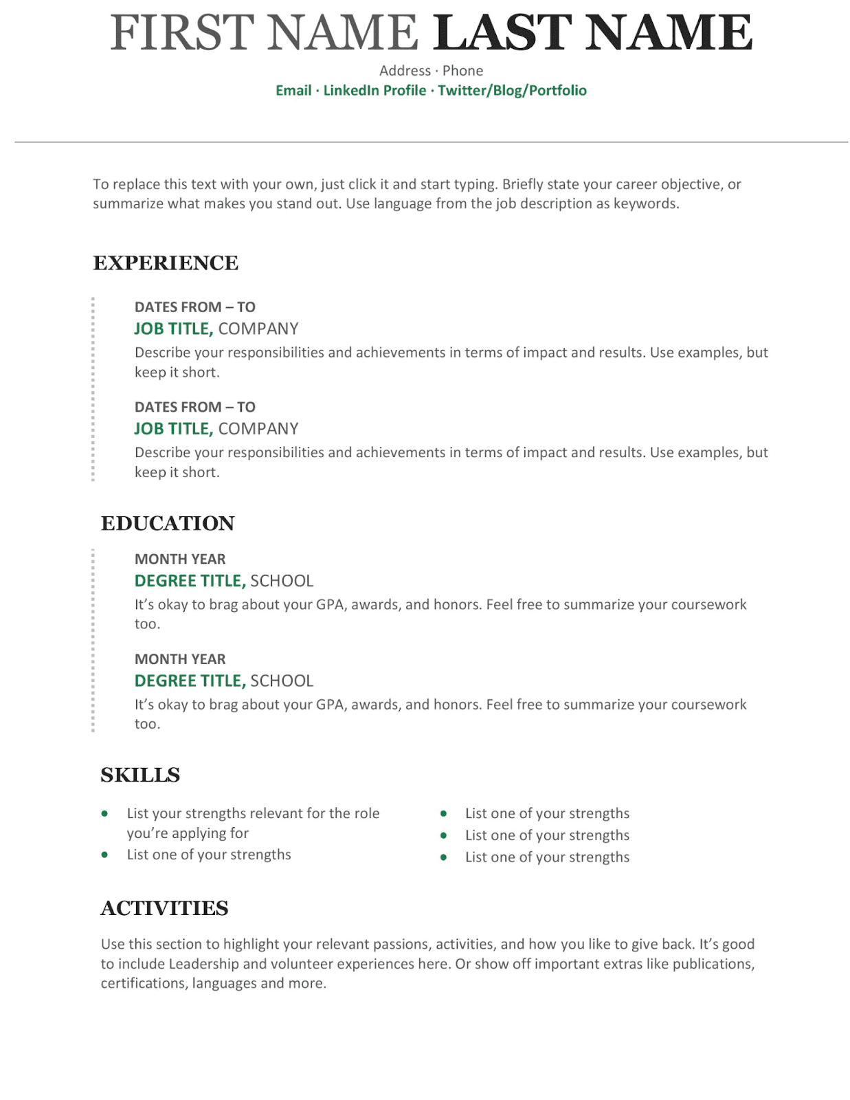
This design lists your experience in reverse chronological order. Your most recent experience will show first.
This way the recruiter finds what they need faster and easier.
The light green color breaks the ice and gives the resume some personality. After all, just because it’s professional doesn’t mean it should be boring!
3) Infographic Word Resume

Do you work in a creative industry where you’ll be designing a lot of content? You can use this colorful resume!
With this template you can list your experience and skills in a unique way that’s easy to follow. The red and white scheme of colors catches the eye but still keeps the look professional.
4) Simple College Template
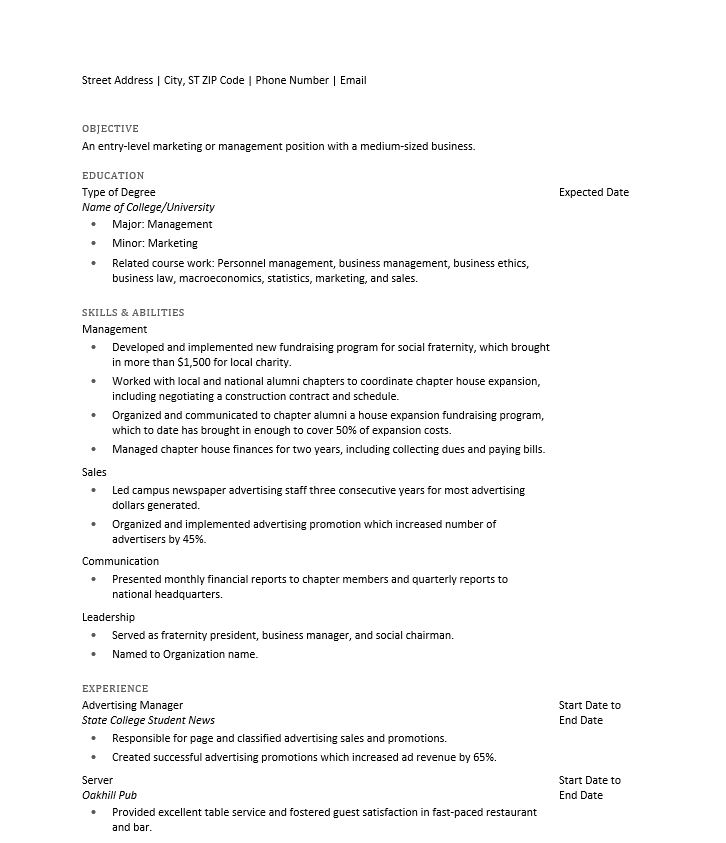
This Word template mainly focuses on Objective, Skills, and Education sections. It’s perfect for recent graduates or entry-level employees who don’t have a lot of work experience to show off.
It has a very simple and straight-forward theme and can be the right choice if you want to play it safe or apply in a conservative industry.
There are great resumes outside of the Microsoft Template gallery as well.
Don’t find yourself in any of the word resume templates we just mentioned?
Don’t worry!
Check out our article on 20+ free and premium Word resume templates.
Key Takeaways
Here’s what you need to take away from this article:
- Applicant Tracking Systems scan your resume before it goes to a recruiter, so you need a resume that the software can read.
- The best format for your resume in 2023 is a PDF. A PDF resume is readable by ATS and also keeps your formatting and style in place. Your best bet is to go for an online resume builder like Novorésumé which downloads your resume as a PDF.
- Word resumes also do the job, but sometimes might be incompatible with the hiring manager’s software. Use Word resumes only if specified in the job posting.
- There’s plenty of resume layouts and templates to choose from, for both Word and PDF. You can pick one that best fits your experience, industry, and style.
Now stop procrastinating on your resume and send it to the recruiter!
Good luck!
